The 3 lessons from Deckers
Chapter 1: A better brief
THIS CAREERS-SITE PROJECT started with a question that sounded practical, sensible, and responsible. At Insurgency, we’ve been around long enough to know that’s usually when we start looking for the problem sitting underneath the one everyone can already see.
"Can you build it?"
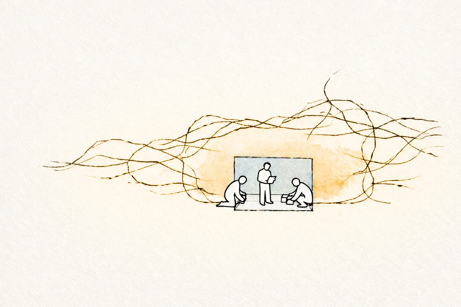
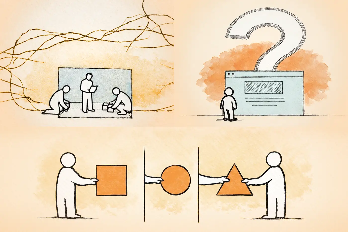
Usually, yes. The bigger risk is that everyone's about to build around the wrong assignment.
We saw that clearly on the Deckers project. The original ask looked contained: support the HR section of the site, translate supplied creative into responsive UX, handle the technical build, and account for analytics. Once the work started, it was obvious the brief was hiding bigger organizational and experience problems nobody had named yet.
The request sounds narrow, so the project gets framed that way. Then the real job shows up after the work already has momentum.
The brief was smaller than the job
The Deckers assignment widened quickly. It wasn't only an HR section build. It touched culture, parent-brand clarity, and how a visitor was supposed to move through the experience. The brief described pages. The real assignment involved audience understanding, ownership, and how the site would live after launch.
If the people shaping the project know what they want to say but haven't worked through how the audience understands the company, who owns the experience, or what the inherited system can actually support, the team is walking into diagnosis work with deadlines attached.
The useful questions sit upstream
Before the project turns into templates, QA, and launch dates, better questions need answers.
- What does the audience need to understand right away?
- Who owns the experience once the external team is gone?
- How maintainable does this need to be in real life, not in theory?
- What implementation constraints are already sitting in the inherited platform, access model, or handoff plan?
They're less glamorous than design review, but they do far more to decide whether the work holds together.
Deckers gave us a simple example. Someone could move from a brand site into the parent-company careers environment and wonder if they had landed in the wrong place. That kind of confusion isn't fixed by prettier layouts alone. Every handoff has a cost.
Other items that can land in the same category:
- Maintainability: If the site is supposed to improve the experience but the internal team still can't update it with confidence, the project has only solved the visible part.
- Implementation constraints: If backend visibility is limited, ownership is split, or the handoff model depends on several teams interpreting the work the same way, the brief should surface that early.
Absent of the above two examples, effort can come back later as delay, rework, or slow-motion confusion about what the project was really trying to do.
Better questions change the quality of the build
That's why we care so much about the opening questions. The build inherits whatever the brief failed to settle.
When the right questions get answered early, the work gets clearer for everyone involved. The audience journey is clearer. Ownership is less vague. Maintainability becomes an operating decision instead of a polite afterthought. Implementation constraints stop showing up as late surprises.
When those questions stay fuzzy, teams still move. They just move with unresolved decisions baked into the work.
That's usually the moment to stop and ask the harder question: are we even solving the right problem?
Chapter 2: Wait, where am I?
IT SHOWS UP the second someone leaves a familiar brand world and lands in a parent company careers environment that doesn't quite explain itself. If that jump feels abrupt, the user doesn't experience it as an architecture problem. They feel it as hesitation. A little drop in confidence.
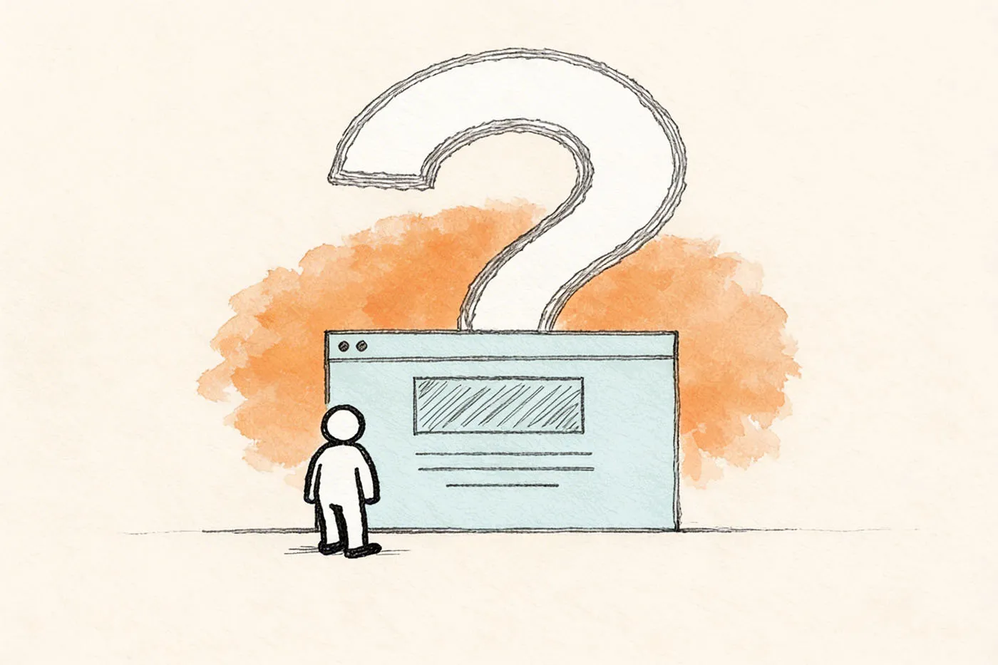
At Insurgency, we saw the problem right where the click landed on Deckers: someone came in through HOKA (or one of the sister brand’s websites) and suddenly had to figure out why, where, and how they ended up in the Deckers’ website Careers section. The team proposed a simple bridge into the parent company careers experience. It mattered because it answered the question the journey had left hanging...
“Am I still in the right place?”
The hesitation starts before the application flow process begins
That's why "make it look better" was the wrong first instinct.
When someone arrives from a brand site, they already have a mental model. They think they're exploring that brand, its culture, and its opportunities. Then the experience asks them to make a bigger organizational jump into the parent company, often with different language and a more corporate level of abstraction. If that transition isn't explained cleanly, the user must stop and re-orient in the middle of what should feel like forward movement.
Most users won't say that in neat UX language. They'll just slow down and think, "Hang on, is this where I meant to end up?" Same effect.
When the user has to decode the handoff, the site is already spending trust it hasn't earned.
Clarity needs to do its job before design can
The objectives weren't just to refresh pages. They included distinguishing culture and values, demystifying Deckers Brands as the parent company, improving navigation, clarifying calls to action, and making the site easier to maintain internally. So no, this was never just a prettier-pages assignment. It's a clarity-and-confidence brief, whether the project names it that way or not.
The experience should explain where the reader is, why the parent company context exists, and what they should do next. After that, visual refinement gets to amplify something solid.
We're not arguing against design quality. We're saying design can't rescue a journey that still wants the audience to figure out the company structure while they're trying to apply for a job. If the visitor is still translating the relationship between the brand they came from and the company now asking them to continue, polish helps less than teams want it to.
Path logic beats polish when the visitor is still trying to figure out the new and unexpected world they just entered.
This is one place that a weak brief becomes visible
In the last piece, we made the case that weak briefs usually hide the real assignment. For this article, we aim to highlight that the weak brief would have allowed the user to feel disjointed in their journey. . A project can look organized internally and still feel slightly off if the brief treats the work like a page build when the real task is carrying a reader across a confidence-sensitive transition.
On Deckers, the user wasn’t the only one being asked to make a jump. Our team met with stakeholders globally and the unresolved user journey states (from brand site, to corporate, to careers) lasted far too long into the creative and development process.
Brand stakeholders may own one layer, corporate stakeholders another, and implementation another. Add a handoff-heavy delivery model on top, and the blurry part of the journey often does not survive because nobody fully plans for the user’s jump itself.
Chapter 3: Blindspot hidden costs
SOME DELIVERY MODELS LOOK CLEAN for the same reason assembly lines do: everyone knows their station. The trouble starts when the work needs judgment, not just movement.
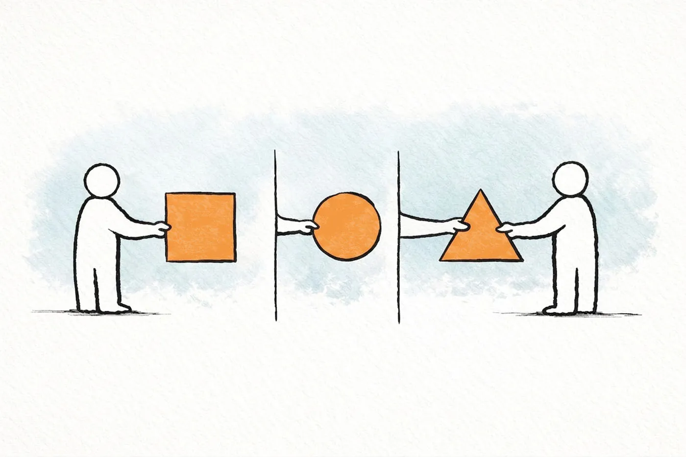
Every handoff asks the next team to infer intent and translate work into a system they may not be able to see clearly enough.
What became clearer to Insurgency as Deckers moved along was that this wasn't only a build problem. It was a handoff problem: too many hands, too little backend visibility, and too much room for the work to change shape on its way through.
Handoffs don't just move files around
They move interpretation around too.
If naming conventions, content flow, backend logic, or implementation constraints aren't visible early, the build team still must keep moving. They make the best assumptions they can. Then the next team interprets those assumptions again inside the CMS or codebase they control. Then QA needs to figure out whether something is a bug or just a different reading of what the work was supposed to do.
That's why handoff-heavy models wear teams down. The work itself may be solid. It still has to survive one more round of interpretation every time it changes hands.
QA is where that gets painfully obvious. The team isn't only checking whether the experience works. It's checking whether the implementation still means what the builders thought it meant.
No backend view means you're building against a silhouette
On Deckers, we were iterating on analytics strategy, but the build team didn't have meaningful visibility into the existing backend structure. The final implementation lived in someone else's environment. At that point, quality turns into an educated guess.
You can still design thoughtfully and build carefully. What you can't do with much confidence is guarantee that the handoff version will behave the same way once it's wired into the live system.
The retrospective evidence here is blunt enough to matter. Once the backend realities became clearer, a large portion of the technical work had to be reworked. That’s what happens when delivery quality has been shaped by missing system knowledge all along.
Analytics confidence drops the same way. If the team shaping the tracking approach isn't the team validating the final implementation, the plan can be thoughtful, and the live firing can still be uncertain.
Fragmented ownership weakens launch confidence
Launch confidence drops when no single team can say, end to end, that the approved work, the implemented work, the QA environment, and the live analytics setup all match. A neat org chart can still produce a messy launch.
This isn't a case for one team doing everything. If the model depends on several teams handing work across invisible system boundaries, the project needs a better diagnostic before anybody calls it efficient.
Who sees the backend early enough to design for reality? Who owns QA truth and analytics verification in the final environment? Who closes the interpretation gaps when the build meets the live system?
Those are operational questions. They also change the user experience materially.
PROJECTS DON'T FAIL the professionalism test just because someone missed something early. That happens. The real test is what the structure does with the miss once it exists. Does it bring the problem into the open fast enough to fix, or does it keep handing it around until it starts showing up as implementation drift, messy QA, and shaky launch confidence? Deckers gave us one answer. We'd rather this series help you avoid learning it the same way.

Contact us
Feel free to drop us a message or if you prefer to kick it old school give us a call at 416-602-2095.